
The Pantone Guide I've Used for 10+ Years…and What I'd Buy Today.
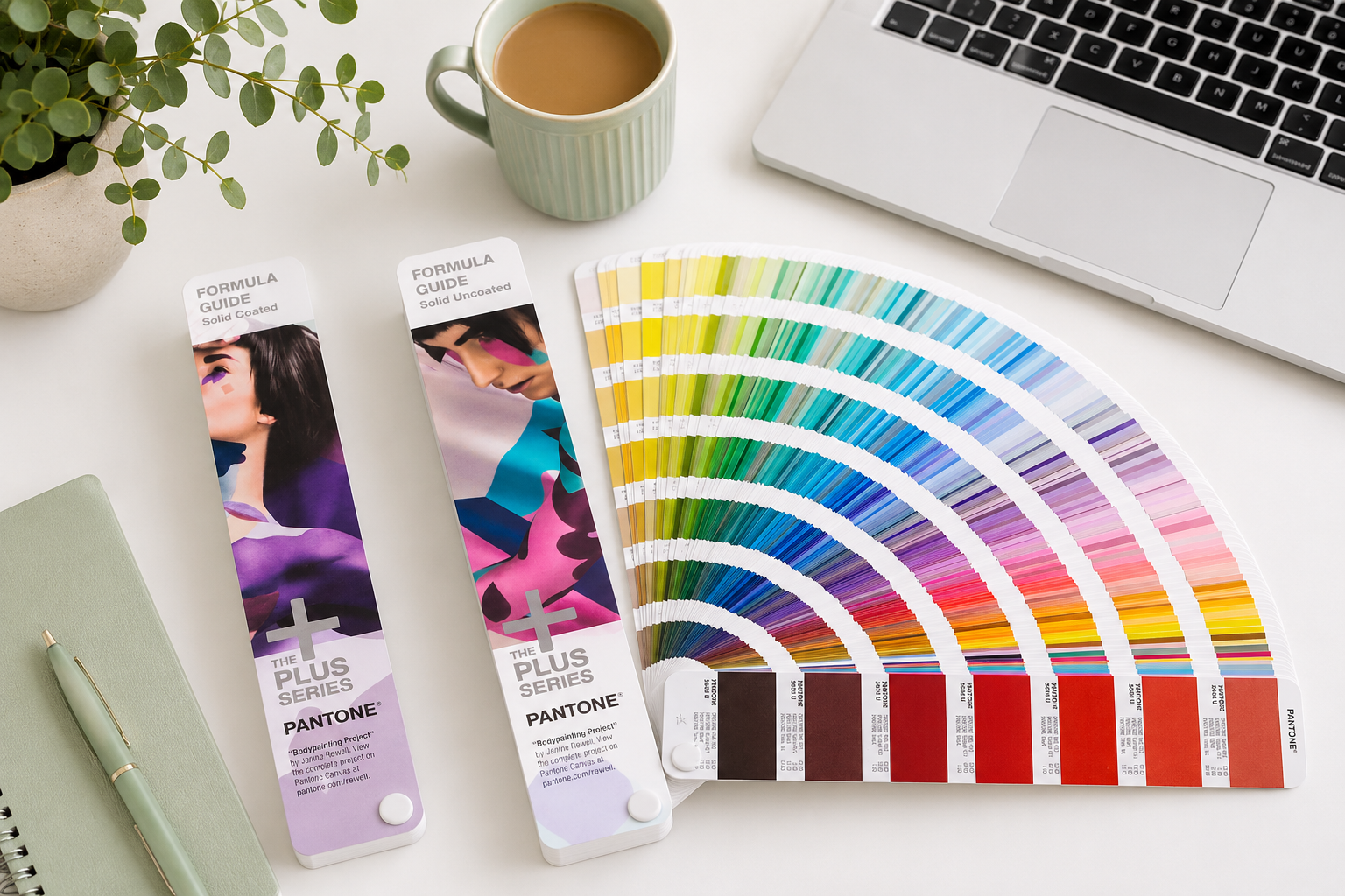
As designers, we spend so much of our working lives looking at colour on screens that it can be easy to forget one fairly important thing: a colour on a screen isn't necessarily what that colour is going to look like when it's printed.
I've had my Pantone Formula Guide Coated & Uncoated set for years. I originally bought mine from Amazon UK and, despite it now being an older edition that's no longer available, it's still something I regularly pull out when I'm working on branding and print projects.
My set has definitely earned its place in my design toolkit.
But the way I work with colour has changed over the years - and so has commercial printing. So are physical Pantone guides still worth having?
Why I Bought a Pantone Guide in the First Place
When I started working professionally in graphic design, Pantone was very much part of the language of print and branding.
Rather than trying to describe a colour as "a dark green" or hoping that everybody's monitor displayed the same shade, you could specify a Pantone Matching System (PMS) colour.
The printer, designer and client then had a recognised physical colour reference to work from.
My set contains two guides - coated and uncoated - because the same colour can look surprisingly different depending on the paper it's printed on.
Coated paper tends to produce a richer, more vibrant result, while uncoated stock absorbs more ink and can make the same colour appear softer or more muted.
Being able to physically compare the two is still incredibly useful.
Why I Still Prefer Seeing Colour in Print
I design digitally, but when I'm developing a brand identity I don't particularly like making every colour decision from my computer screen.
Screens are illuminated. Paper isn't.
Different monitors can display colour differently, brightness settings change what you're seeing and RGB colours can look considerably more vibrant than their printed equivalents.
That's why I still like sitting down with an actual colour guide and flicking through it.
There's something very different about being able to put two or three colours beside one another and see how they actually interact on paper.
I often use my Pantone guides during the early stages of choosing a colour palette, even when I know the final piece may ultimately be printed in CMYK rather than using Pantone inks.
But Do Printers Still Use Pantone?
Yes…but perhaps not in quite the same way they once did for everyday commercial printing.
Pantone spot colours are still very important where accurate and repeatable brand colour is required. They're also useful for specialist colours and print processes that standard CMYK can't reproduce particularly well.
However, a lot of the commercial printing I send out today is produced using CMYK four-colour process printing.
Brochures, menus, flyers, posters and other everyday marketing materials will very often be supplied as CMYK artwork rather than printed using individual Pantone spot inks.
And there's a practical reason for that.
Printing a specific Pantone ink can add additional cost, whereas a commercial printer already running CMYK can reproduce an enormous range of colours using combinations of cyan, magenta, yellow and black.
So while I still use Pantone as a colour reference, I'm not necessarily specifying a Pantone spot ink for every print job.
Pantone vs CMYK – What's the Difference?
The simplest way I think about it is:
Pantone gives you a specific standardised colour.
CMYK creates colour by combining percentages of cyan, magenta, yellow and black.
They're two different approaches to producing colour in print. And importantly, not every Pantone colour can be reproduced exactly in CMYK. That's something worth remembering when you're creating a brand.
You might fall in love with a particularly vibrant Pantone colour only to discover that its CMYK equivalent looks noticeably duller when your everyday marketing material is printed.
For a brand that's going to exist across websites, social media, office printers, digital printing, signage and professional commercial print, I think it's important to consider that from the beginning.
How My Colour Workflow Has Changed
My Pantone guides are still something I use and enjoy having in the studio, particularly when I'm developing colour palettes and want to see colours physically printed rather than relying entirely on a screen.
However, my workflow has changed over the years.
Pantone has moved much of its digital colour library and colour conversion functionality into Pantone Connect, its subscription-based platform. When I need current Pantone colour information and accurate colour values, that's now where I go rather than relying on the codes in my older physical guides.
For many of the smaller businesses I work with, though, we don't necessarily need to specify a Pantone spot colour at all.
A lot of their everyday commercial printing — business cards, brochures, menus, flyers, signage and other marketing material — is produced in CMYK. In those cases, I'll build the print colour palette around CMYK values and then create the corresponding RGB and HEX colours for digital use.
It keeps things practical for the client and works well with the commercial printers they're likely to use.
The Pantone Guide I Own
My own set is an older Pantone Formula Guide Coated & Uncoated from the Pantone PLUS series. I bought it from Amazon UK years ago and the exact edition I own is no longer available. It has been updated since then, with newer Formula Guides containing an expanded range of colours. I still use mine because I know it well and find it extremely useful for comparing colours and getting a physical sense of how a palette might work.
There is an important caveat here, though. Pantone recommends replacing physical guides periodically because printed colours can change with age, light exposure and handling. So I wouldn't use my older set as the final authority on a colour-critical Pantone print run.
For inspiration, comparison and working through colour ideas, however, mine still gets plenty of use.
So Why Do I Still Use My Old Pantone Guides?
Because there's still a difference between choosing a colour on a screen and seeing a colour printed on paper.
My guides have become as much a physical colour reference and creative tool as a way of specifying Pantone inks. I can flick through them, compare shades and see the difference between coated and uncoated stock while I'm developing a palette.
If a project requires an exact current Pantone specification, I'll check that against Pantone's current digital system rather than assuming that my older guide is still the definitive reference.
What Would I Buy Today?
Pantone now offers much of its digital colour library and colour conversion functionality through Pantone Connect, its subscription-based platform. If I were starting from scratch today, I'd actually think a little more carefully about which Pantone guide suited the type of design work I do.
There are three I'd consider.
Pantone Formula Guide Coated & Uncoated
This is the current version of the type of guide I've used for years.
If you're working with Pantone spot colours, branding, logos, packaging or colour-critical print, this is still the classic choice.
It contains physical Pantone colours on both coated and uncoated stock, allowing you to select and specify an actual Pantone colour rather than relying on a screen.
Pantone CMYK Guide Coated & Uncoated
This is particularly interesting if most of the commercial printing you produce is CMYK.
Instead of concentrating on spot colours, the CMYK Guide gives you physical examples of colours that can be reproduced using four-colour process printing along with their CMYK values.
I can see this being extremely useful for designers who primarily produce brochures, stationery, menus, posters, packaging and other commercially printed material.
You still get the benefit I love about a physical colour guide – seeing the colour printed on actual paper – but you're choosing colours specifically with CMYK reproduction in mind.
Pantone Color Bridge
If I were buying another guide for my own work now, Color Bridge is probably the one I'd be most interested in adding to my toolkit.
It takes a Pantone spot colour and shows it alongside its closest CMYK process reproduction. That's particularly useful for the kind of work I do because I'm rarely designing something that exists in only one medium.
A brand identity might need to work across:
Pantone → CMYK print → RGB → HEX for the website
Being able to see how a Pantone colour translates into process printing makes a lot of sense when you're creating a brand that has to remain visually consistent across all of those applications.
So, Is a Pantone Guide Still Worth It?
For me, yes. But perhaps for a slightly different reason than when I originally bought mine. I don't think every designer necessarily needs to specify Pantone spot colours for every project, particularly when so much commercial printing is now produced in CMYK.
What I do think is incredibly valuable is having a reliable physical reference for colour.
Designing entirely on screen can give you a false sense of how bright, saturated or rich a colour is going to be once it's printed.
A physical guide gives you something tangible to work with. And after years of using mine, I still find myself reaching for it.
One Thing I'd Tell New Designers
Don't assume the numbers on your screen tell you the whole story.
A HEX colour that looks gorgeous on your MacBook might not translate beautifully into CMYK. A Pantone colour may look different on coated and uncoated paper. And the colour coming from an office printer isn't necessarily an accurate representation of what a professional commercial printer will produce either.
If something is particularly colour-critical, talk to your printer and request a proof.
Colour management is one of those areas where physical print still matters.
And that's probably why, despite almost everything else about my design workflow becoming digital, there are still two very well-used Pantone fans sitting in my studio.
Affiliate Disclosure
Some of the links in this article are Amazon affiliate links. If you make a purchase through one of these links, I may earn a small commission at no additional cost to you.
I purchased my own Pantone Formula Guides myself from Amazon UK many years ago. My particular edition is now discontinued. Any newer Pantone products I've linked to above are current alternatives that I think may be useful based on my own experience as a graphic and web designer; I haven't received these products for free.